In this post I’ll be showing the three photos I posted yesterday, with a bit of a more in depth show of why I personally think the photos are good. Without delaying it here we go…
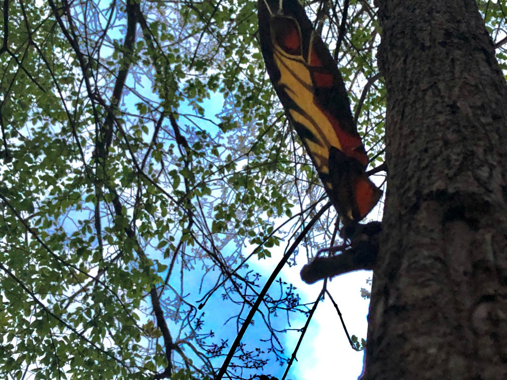
For me I believe this photo works in several ways. You have earthly colors clashing together to form a nice even blend of blues and greens. You have Mothra perched on a branch almost giving a look as if she is protecting the area. The greens clash in contrast with the orange and browns of Mothra making her stand out yet the shape of her wings makes her feel as if she belongs in the nature setting. Also, the perspective of looking up at her emphasizes the idea that the character of Mothra is like a goddess, and is look up to and worshiped.
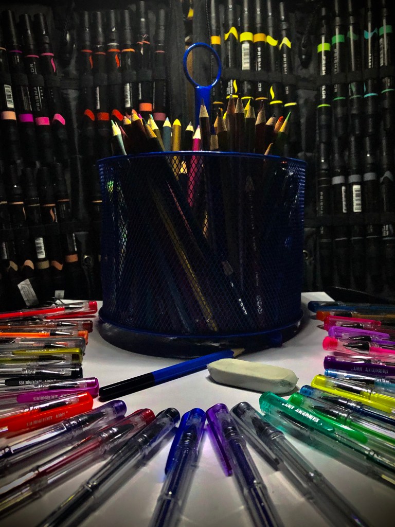
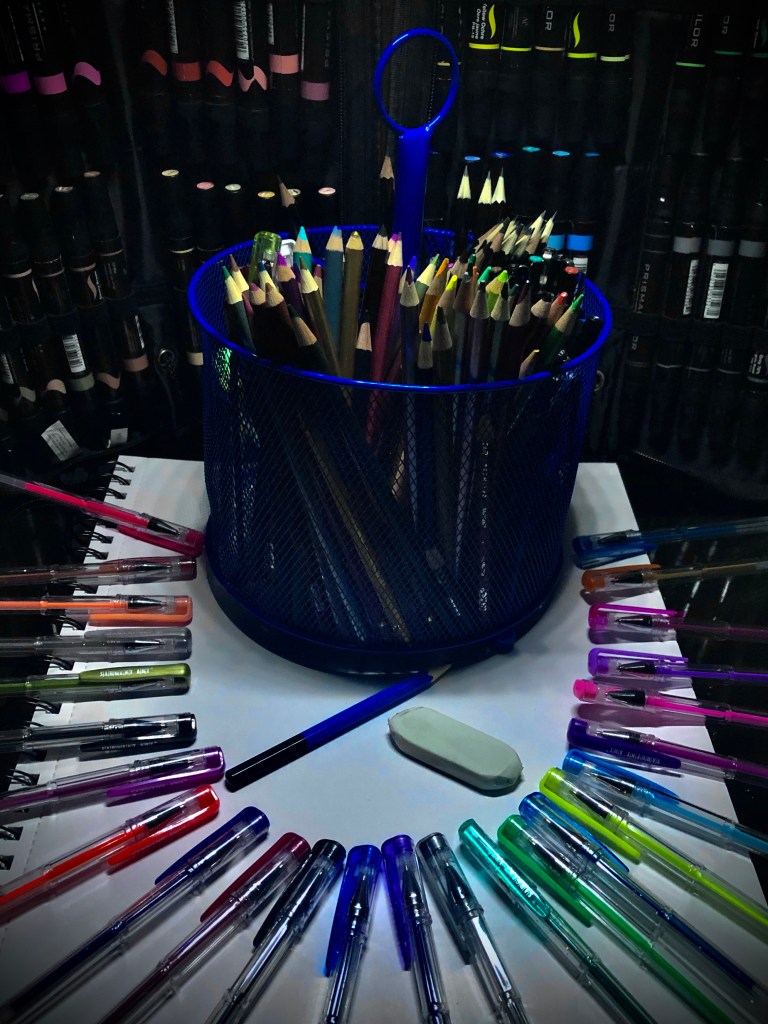
These two photos (in my eyes) are good for mostly the same reasons. Firstly the vast colors throughout the image already make it appealing to the human eye. In both photos the gel pens at the bottom draw the viewer in with the vast colors. Then with them all pointing towards the middle it moves the eyes to the center where we see the container of more art supplies. I personally see this better done in the second photo since it is from an arial angle, showing more of its contents rather then a dark blob in the middle. The contents in the middle of the holder offer a nice assortment of art tools to look at, as well as the gel pens and the markers too.
